What Makes a Rug Look Expensive?
Posted by Rehan Manzoor
Filed in Family & Home 217 views
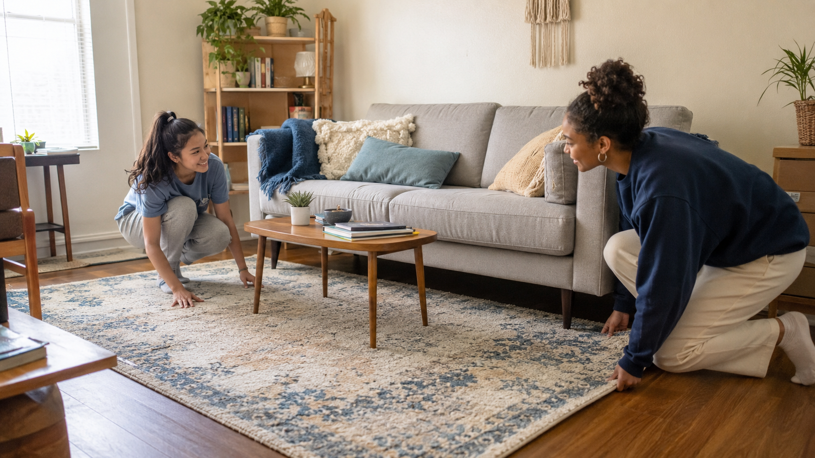
Place two similar rugs in the same room, and one may instantly look more refined. The difference is not always the price. A reasonably priced rug can appear luxurious, while an expensive purchase may look awkward once it reaches the floor.
So, what creates that polished effect? Size carries more weight than most buyers expect. Texture, colour depth, pattern scale, edge finishing, and furniture placement also shape how we judge quality.
Well-chosen modern rugs create a sense of balance without demanding all the attention. They connect the furniture, add depth, and look natural within the room. A rug begins to look cheap when its size, colour, or construction fights against everything around it.
This guide explains the visual details that create a high-end appearance. It also covers practical ways to make an affordable rug look better without pretending that price never matters.
The Expensive Look Starts With the Right Proportions
Size affects the result before anyone notices the material. A small rug floating beneath a coffee table can make a carefully furnished living room seem unfinished. The furniture looks separated, and the floor arrangement lacks a clear centre.
A generously sized rug produces the opposite effect. It brings the sofa, chairs, and table into one visual group. The room appears more intentional because each piece has an obvious relationship with the others.
In most living rooms, at least the front legs of the main seating should rest on the rug. Larger rooms may look better when every furniture leg sits fully on it. Consistency matters more than following one strict placement rule.
The surrounding floor border deserves attention too. Leave a reasonably even amount of visible flooring around the edges. A rug pushed against one wall and far away from another can make the layout appear accidental.
Before buying large modern rug designs, mark the dimensions with painter’s tape. View the outline from several doorways. A few extra minutes of measuring can do more for the expensive look than paying for a luxury label.
Texture Creates the Depth Cheap-Looking Rugs Often Lack
Texture gives a rug physical and visual character. Flat surfaces can still look attractive, but they need strong colour or pattern quality. Rugs with layered fibres, carved details, or slight height changes create natural shadows and depth.
Run your hand across the rug if you are shopping in person. Dense fibres usually feel fuller and more supportive. Sparse fibres may reveal too much backing when separated, which can make the surface appear thin.
Dense fibres and visible dimension
Density matters more than extreme thickness. A dense low-pile rug may look richer than a loose shag design. The fibres should sit closely enough to create an even surface without obvious gaps.
Carved patterns can add dimension when used carefully. A small height change around geometric lines or abstract shapes catches light in an understated way. Excessively deep carving, however, can make the design harder to clean.
Fringe also affects the result. Neat, evenly spaced fringe may support a traditional or relaxed style. Uneven or overly shiny fringe can make the finishing look rushed.
Controlled softness instead of excessive shine
Some fibres reflect light more than others. A soft sheen can give a rug depth, especially with viscose or blended yarns. Too much shine may create a plastic appearance under strong lighting.
The room itself changes this effect. A glossy rug beneath bright ceiling lights may look very different from the same rug in soft daylight. Order a sample when possible and view it throughout the day.
Well-made textured contemporary rugs use fibre variation with restraint. The surface should feel interesting without competing with every other item in the room.
Balanced Colours Make a Rug Feel More Refined
Expensive-looking colour is rarely one flat shade. Even a cream rug may contain ivory, beige, oatmeal, and pale grey fibres. These small variations add depth and prevent the surface from looking printed or artificial.
Muted colour does not mean dull colour. Deep navy, forest green, rust, burgundy, and warm brown can look rich when their undertones suit the room. The problem begins when a shade feels overly bright or disconnected from nearby finishes.
Look at the largest fixed colours around the rug. Flooring, sofas, cabinets, and wall paint are harder to change than cushions. The rug should share at least one undertone with those elements.
For example, creamy walls and warm oak furniture usually pair better with beige than icy grey. A charcoal sofa and black metal table might suit cooler blue, silver, or stone tones.
Thoughtful elegant floor rug colours also age better than short-lived trends. If you enjoy a bold colour, use it in a layered pattern instead of one uninterrupted block. That approach feels more natural and hides minor wear more effectively.
Pattern Quality Shows in the Small Details
A pattern does not need to be traditional to look valuable. Abstract, geometric, distressed, and minimalist designs can all create a polished result. Scale and balance matter more than the style category.
Look for even spacing and clear relationships between shapes. Poorly scaled patterns may feel crowded on one side and empty on the other. Repeated motifs should flow naturally across the surface instead of ending awkwardly at the edges.
Traditional rugs often gain richness from layered borders and small colour changes. Abstract designs rely more heavily on controlled movement. Geometric patterns need clean lines and accurate spacing, since mistakes are easier to notice.
Consider the furniture pattern before making a decision. A detailed sofa may work better with a quiet rug. Plain furniture gives designer-style modern rugs more room to carry a stronger pattern.
Product photographs can hide scaling issues. Check images that show the entire rug from above. Customer photos are useful because they reveal how the pattern looks beneath real furniture rather than studio lighting.
Materials and Construction Reveal Long-Term Quality
Price can influence material quality, but fibre names do not tell the whole story. A poorly made wool rug may shed heavily, while a well-constructed synthetic one can look polished for years.
Wool has natural softness, warmth, and resilience. It often develops a rich surface because the fibres absorb and reflect light gently. However, wool usually costs more and may require careful stain treatment.
Polypropylene and polyester offer affordable alternatives. Their quality varies widely. Dense construction, controlled sheen, and secure edges help synthetic rugs look more refined. Thin fibres and loose weaving can create the opposite effect.
Viscose provides a silky appearance but may mark easily from water or heavy furniture. Blended materials attempt to balance softness, strength, and cost. Read the care instructions because appearance alone does not reveal maintenance needs.
Turn the rug over if possible. Check the backing, edge binding, and stitching. Straight edges and secure finishing suggest better care during production. Loose threads, uneven corners, and visible adhesive may become worse with use.
Not all area rugs require handmade construction to look impressive. Machine-made options can offer precise patterns and consistent surfaces. The real test is whether the construction supports regular use without curling, shedding, or losing shape.
Styling Choices That Make an Affordable Rug Look Better
Even a high-quality rug can look disappointing when poorly placed. Start by centring it with the furniture arrangement, not necessarily with the entire room. The seating area may sit slightly off-centre because of doors, windows, or a fireplace.
For living room area rugs, keep the furniture placement consistent. Put the front legs of the sofa and all main chairs on the rug, or place everything fully on it. Mixed positioning tends to look less deliberate.
A rug pad makes a visible difference. It reduces movement, adds slight cushioning, and helps the rug lie smoothly. Choose one slightly smaller than the rug so it remains hidden.
Remove wrinkles and curled corners before judging the result. Some rugs need several days to relax after delivery. Reverse rolling can help, though you should follow the seller’s instructions to avoid damaging the backing.
Lighting deserves a second look as well. Soft lamps often reveal texture more attractively than harsh overhead lighting. Natural daylight shows the true colour and helps you notice unwanted undertones.
Finally, repeat one rug colour elsewhere in the room. A cushion, vase, or piece of artwork is enough. This small connection helps large area rug styles feel like part of the room rather than a separate purchase.
Details That Can Make a Rug Look Cheaper Than It Is
The most expensive rug can lose its appeal if the corners curl. Ripples, loose threads, stains, and crushed sections draw attention away from the design. Regular care protects the appearance as much as the original construction.
Too many competing patterns create another issue. A bold rug, patterned sofa, printed curtains, and detailed wallpaper leave no visual resting point. Allow one or two elements to lead while the others provide support.
Incorrect undertones are less obvious but equally disruptive. A cool white rug can look harsh beside warm ivory walls. The rug may be beautiful on its own, yet still feel wrong in that room.
Furniture proportions also matter. A tiny rug beneath a large sectional makes the seating look oversized. A huge rug packed into a narrow room can remove the visible border that gives the arrangement structure.
Poor maintenance eventually affects perceived value. Dirt dulls colour, while grit cuts into fibres. Vacuum according to the care label, rotate the rug occasionally, and treat spills quickly. A modest rug in good condition often looks better than a neglected luxury piece.
Create a High-End Look Without Paying Only for a Label
An expensive-looking rug begins with proportion. Choose a size that connects the furniture and leaves a balanced border of visible floor. Then look closely at texture, colour variation, pattern scale, and edge finishing.
Material matters, but it is only part of the decision. Dense synthetic construction can look more refined than low-quality natural fibre. Maintenance also affects long-term appearance, so select a surface you can care for realistically.
Once the rug arrives, use a suitable pad and give it time to lie flat. Adjust the furniture placement and repeat one rug colour elsewhere in the room. These small choices create a more polished result without increasing the purchase price.
A recognisable label may raise the cost, but it does not guarantee a better room. The rug that looks most expensive is usually the one that fits properly, supports the furniture, and remains attractive after daily use.
Frequently Asked Questions
Do wool rugs always look more expensive?
No. Wool often has natural depth, softness, and resilience, but construction still matters. A poorly finished wool rug can look less polished than a dense, well-made synthetic design.
Which rug colours create a high-end appearance?
Layered neutrals, muted earth tones, deep blue, warm brown, and controlled jewel shades can look refined. The most successful colour is one that works with the room’s flooring, furniture, and lighting.
Can a synthetic rug look luxurious?
Yes. Look for dense fibres, low shine, secure edges, and balanced colour variation. High-quality polypropylene, polyester, and nylon rugs can create a polished appearance while offering easier maintenance.
How can I make an inexpensive rug look better?
Use the correct size, add a suitable rug pad, remove wrinkles, and position furniture consistently. Repeating one rug colour in cushions or artwork will also help connect it with the room.
Does a larger rug make a room look more expensive?
Often, yes. A properly sized rug connects furniture and makes the layout feel planned. However, it should still leave some visible flooring around the edges. Bigger is not automatically better if the proportions are wrong.