A Curator's Guide to Eclectic Mosaic Flooring: Shape, Material, and Balance
Posted by Dimai Kandi
Filed in Other 46 views
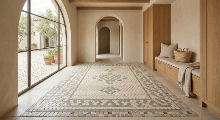
Great design often looks effortless, but it never is. Beneath every beautifully layered floor lies a network of decisions—each one deliberate, each one in conversation with the others. That's the essence of eclectic mosaic work: complexity held together by quiet discipline.
The shift away from single-format uniformity has been building for years. Tile manufacturers now produce an enormous range of shapes, finishes, and materials, giving designers more tools than ever before. The question is no longer whether to mix but how to mix well.
Because done carelessly, mixing collapses into visual noise. The floor is the room's most expansive surface, and it carries an enormous amount of visual information. These principles help you manage that information with confidence.
The Case for Breaking Uniformity
A single tile running across an entire floor creates continuity. It also creates a kind of visual stasis—the eye absorbs the pattern quickly and finds nothing beyond it to engage with.
Introducing contrast disrupts that stasis productively. When two formats share the same surface, the floor acquires what designers refer to as visual rhythm: a sense of movement, layering, and discovery that makes a room feel alive.
There's a functional argument as well. In open-plan homes, shifting from one tile format to another creates invisible boundaries. A patterned zone near the kitchen communicates a different purpose than a plain area extending toward the living space. The floor maps the home's functions without requiring any physical partition.
Rule 1: Commit to a Restrained Color Range
Before exploring anything else, fix the palette. Two or three tones are sufficient for virtually any composition.
Warm neutrals—ivory, soft taupe, gentle gray—form the most adaptable foundation. They tolerate wide variation in shape, material, and texture without producing visual conflict. Bolder accents layered against this backdrop gain definition and purpose.
The key insight is that color should play the supporting role while shape and material take center stage. Muted earth tones and warm grays accommodate tiles with more personality—those carrying visible texture, richer color, or intricate detail—without the composition feeling scattered.
Think of the palette as a stage. A neutral backdrop allows every performer to be seen clearly. A cluttered backdrop forces the audience to work too hard.
Rule 2: Create a Clear Hierarchy
Equality among tiles sounds democratic. It produces chaos. One element must dominate in area and quiet in character, providing the visual equivalent of a deep breath.
Designate one tile as the foundation—large, neutral, covering the majority of the floor. A secondary tile introduces variation through pattern, a different finish, or a smaller format. The accent tile, occupying a small fraction of the surface, delivers a concentrated moment of visual interest.
The 60-30-10 distribution applies directly: sixty percent base, thirty percent secondary, ten percent accent. This structure ensures the composition remains balanced while preserving variety.
Base tiles in chalky whites, muted clays, or soft earth tones serve this anchoring function superbly. Their restraint gives everything layered above them permission to be noticed.
Rule 3: Pair Shapes That Generate Productive Contrast
Geometry provides the creative fuel for eclectic compositions. Hexagons, squares, rectangles, diamonds, triangles—each form introduces a different visual frequency.
A reliable combination: hexagons as the dominant field with a square-tile border at the perimeter. The contrast in form establishes a natural boundary, comparable to the way an area rug defines a seating area within a larger room.
Keeping color constant while shifting shape is equally effective. Two tiles sharing the same tone but differing in geometry allow the grout lines to generate the pattern. The result is restrained, sophisticated, and broadly adaptable.
The seam where two different shapes meet deserves particular attention. That junction—where a hexagon touches a rectangle, where a diamond meets a square—becomes a design moment in its own right. Mosaic floor tiles arranged with awareness of these contact points produce compositions that reward close inspection. Even subtle contrasts in form can redirect the mood of an entire space.
Rule 4: Manipulate Scale to Direct Attention
Scale shapes perception in ways that operate below conscious awareness. Large formats feel expansive and calm. Small formats feel concentrated and detailed. Combining both gives you control over where the eye travels.
Use large tiles to establish the dominant field—a serene canvas anchoring the composition. Deploy smaller elements—mosaics, penny rounds, compact hexagons—as focal points at strategic moments.
Two rules prevent scale mixing from producing discord. First, change one attribute at a time: if sizes vary, keep the finish consistent. If finishes differ, keep the format uniform. Second, consider the relationship between floor and wall surfaces—a detailed floor pairs naturally with simpler walls, and the reverse holds true.
Evaluating scale in person is essential. A ceramic tile shop with floor-to-ceiling displays lets you compare formats at actual size. What appears proportionate on a screen may feel cramped or cavernous when placed on the ground.
Rule 5: Merge Materials Through What Connects Them
Ceramic, stone, glass, porcelain—each material contributes distinct qualities to the composition. Weight, warmth, reflectivity, grain—these characteristics multiply when materials are blended thoughtfully.
Glass accents within a porcelain field introduce luminosity and color depth. Concrete-effect surfaces paired with brick-look pieces generate understated warmth. Natural stone beside wood-look porcelain bridges organic texture with contemporary crispness.
The essential requirement is a linking thread. Color, finish, sheen, undertone—something must bind these materials together so they feel related rather than randomly assembled. Without that connection, the composition lacks coherence.
When sourcing mosaic floor tiles across material families, search for that shared quality deliberately. A terracotta wall piece shares warmth with a limestone floor. A fishscale detail in a shower niche echoes undertones found in the broader palette. The bond can be as subtle as a matching matte surface or a parallel warm cast.
Curated displays at a well-organized ceramic tile shop reveal these invisible relationships—groupings organized by undertone, finish category, or textural affinity. Learning to identify those connections transforms the selection process from guesswork into informed composition.
Rule 6: Use Borders to Impose Order
Borders are structural tools, not afterthoughts. They contain complexity and simplify execution simultaneously.
A defined perimeter border around an active field pattern provides the eye with a resting place. It encloses the visual energy, creates a sense of completeness, and establishes a clean frame around the room's edges.
Transitional strips between different-format zones perform the same function at a smaller scale. A single course of brick-format tile between two larger fields signals a change in rhythm without abruptness. In open-plan settings, these transitions accomplish spatially what walls would accomplish structurally.
Borders also reduce installation complexity by simplifying cuts along the perimeter. The aesthetic benefit—cleaner edges and tighter joints—reinforces the practical one.
Rule 7: Concentrate Pattern and Frame It Generously
Pattern and plain exist in a push-pull relationship. A room saturated with ornament becomes exhausting. A room without any becomes forgettable.
Restrict your most decorative work to a defined area—a feature wall, a floor inset, a shower alcove. Let that section carry the complexity while surrounding surfaces remain calm.
A striking backsplash mosaic gains presence when the floor beneath it uses large, monochromatic tiles. The quiet ground amplifies the pattern rather than diluting it. At floor level, a detailed inset framed by broad, plain formats reads as a deliberate focal point.
When decorative elements are concentrated and bordered, they become landmarks within the room. The surrounding simplicity ensures they command attention rather than dissolving into undifferentiated visual noise.
Practical Considerations
Several practical decisions will shape the floor's lasting impression regardless of aesthetic intent.
Grout selection deserves the same attention given to tile choice. Joint color and width alter the finished appearance fundamentally. Dark grout defines every edge crisply. Tone-matched grout softens the grid and lets the tile surfaces speak more prominently.
Always test physical samples in the actual installation space. Showroom lighting creates conditions that residential environments rarely replicate. Lay samples side by side, observe them across different times of day, and give yourself several days before deciding.
Have your installer plan the complete layout before any tile is cut. Grout-line alignment across different formats is among the most consequential details in any multi-format project. Consult a ceramic tile shop for installer recommendations—experience with varied layouts makes a measurable difference.
Scale ambition to room dimensions. Generous spaces absorb bold, large-scale patterns easily. Tighter rooms benefit from restraint—a single accent section or a carefully positioned detail band delivers more impact than complexity spread across every surface.
Closing Thoughts
An eclectic mosaic floor is not a random assembly. It is a series of interconnected decisions about color, shape, scale, material, and boundary—each one reinforcing the others.
Restrict your palette. Define roles for each tile. Combine geometries with purpose. Balance scale deliberately. Connect materials through shared qualities. Frame busy sections with borders. Allow calm surfaces to support patterned ones.
When these principles hold, the floor merges with the architecture as though it were part of the original plan. It doesn't demand attention—it earns it. And that sense of inevitability, of a surface that was always meant to be exactly where it is, marks the difference between a floor that impresses and one that truly endures.