Why Mobile-First eCommerce Development Matters More Than Ever
Posted by Steve Jonas
Filed in Technology 19 views
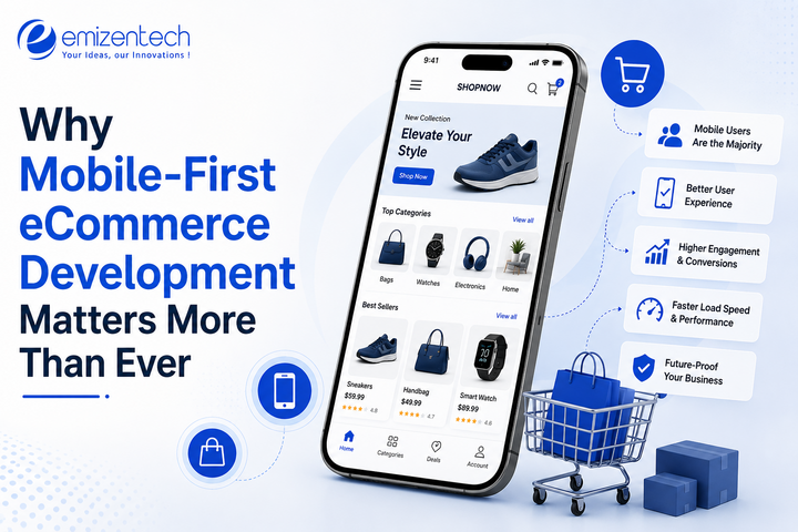
Phones have basically taken over shopping. Someone's checking a product on the train, adding it to the cart while the coffee's brewing, finishing the order on a lunch break—that's just normal now. And if a site can't keep up with that on a small screen, people close the tab and move on, with no real hesitation. Two terms get mixed up a lot here, so it's worth splitting them: mobile-friendly usually means a site was adjusted to work on a phone after the fact, while mobile-first means the phone was where the whole thing started. Small wording difference. Big practical one.
What Does Mobile-First Ecommerce Development Actually Mean
It's not the same as squeezing a desktop layout down until it fits a smaller screen; that's more what "responsive design" used to mean, and honestly you can usually spot a site built that way. Buttons sit too close together, and text shrinks past readable menus that made total sense on a big monitor and turn into a tapping-and-pinching ordeal. Mobile-first flips that around. Start with the smallest screen, figure out what actually needs to be there, then build outward for tablets and desktops. Sounds like a technical footnote. It ends up steering almost every choice that comes after, down to how much copy makes it onto a product page.
Why Mobile Shopping Has Taken Over
Didn't happen out of nowhere. A few real things pushed it this direction.
-
Phones are everywhere, constantly. More time in someone's hand than a laptop ever got
-
Social platforms turned scrolling into shopping. Instagram and TikTok made that link direct, and it's almost entirely a mobile behavior
-
People want checkout done fast. Typing a full card number on a phone keyboard isn't anyone's idea of fun if there's a shortcut
-
Buying habits changed along the way too comparing prices, skimming reviews, closing the sale, sometimes inside one five-minute mobile session
Key Benefits of a Mobile-First Approach
This isn't about chasing a trend. It shows up in real numbers how fast pages load, how long people stay, and whether they actually buy.
Faster Load Times and Better Performance
Mobile-first builds tend to run leaner from the start, since every extra piece had to earn its spot on a small screen. That usually means faster loading across the board, desktop included.
Improved User Experience and Navigation
Menus, buttons, filters — all of it gets trimmed down out of plain necessity when mobile comes first. That trimmed-down version often ends up working better for desktop visitors too, even though it wasn't designed with them in mind.
Higher Conversion Rates
A tighter path from browsing to checkout on a small screen means fewer people bail halfway through. It's one of those shifts that's obvious once you actually compare numbers from before and after.
Better Search Rankings
Google's run on mobile-first indexing for a while now, so a site's largely judged by its mobile version, not the desktop one. A weak mobile build can quietly hurt rankings without anyone tracing the problem back.
Stronger Customer Retention
A rough mobile experience is about as quick a way as any to lose someone for good. A smooth one gives them an actual reason to come back rather than just wandering off to a competitor's site.
What Happens When Ecommerce Sites Ignore Mobile-First Design
Skipping this isn't a neutral call. It costs something, even when the cost doesn't show up right away.
-
Bounce rates climb. People leave in seconds if a page loads slowly or looks broken
-
Cart abandonment eats into sales. A clunky mobile checkout is one of the more common reasons a cart gets left behind
-
Search visibility drops. Google leans hard on mobile performance, so a rough mobile site can drag rankings down without much warning
-
A worse brand impression tends to stick too a phone experience that feels outdated reflects on the whole business, fair or not
Core Elements of a Strong Mobile-First Ecommerce Site
A handful of practical things tend to separate a site that actually works on mobile from one that just barely loads.
-
Simplified navigation. Fewer menu layers, clear categories, a search bar that's easy to actually find
-
Touch-friendly design. Buttons and links sized for a thumb, not a mouse pointer
-
Fast page speed. Compressed images, minimal clutter, pages loading in a couple seconds rather than ten
-
Mobile payment options. Apple Pay, Google Pay, one-tap methods that skip the manual typing altogether
-
Optimized product images and videos matter here too visuals that load quickly without looking cheap, since photos often do most of the selling on mobile
How Businesses Can Transition to Mobile-First Development
Making the switch doesn't usually mean tearing the site down and starting over. It's more of a gradual reprioritizing, and it's exactly the kind of work businesses often bring in outside eCommerce development services for, especially once the in-house team's already stretched thin.
-
Start with a real audit. Test the actual site on an actual phone, not just a browser's mobile preview, and note where it genuinely falls apart
-
Fix checkout first. That's usually where the biggest losses happen, so it's worth tackling before anything else
-
Rework the media. Large, unoptimized images are one of the most common reasons mobile pages crawl
-
Test across different devices. A site that runs fine on one phone doesn't always behave the same on another
-
Once the technical work starts piling up, especially with a bigger catalog, that's usually when bringing in outside help actually pays off
Conclusion
Mobile shopping stopped being a side channel a while back for most stores; it's the main one now. Businesses that treat mobile as an afterthought tend to feel it eventually, whether that's higher bounce rates, softer conversions, or search rankings that quietly slip for no obvious reason. Building mobile-first from the start, instead of patching a desktop site after the fact, tends to save both time and money down the line, and it gives customers something that actually fits how they shop now. EmizenTech has worked with businesses going through exactly this shift, helping them figure out where their mobile experience falls short and what it actually takes to fix it.
FAQ
1. What's the real difference between mobile-friendly and mobile-first design?
Mobile-friendly usually means a desktop site got adjusted to fit smaller screens. Mobile-first means the smallest screen was the starting point for every decision, which tends to produce something cleaner and faster.
2. Does switching to mobile-first mean rebuilding the entire website?
Not necessarily. A lot of businesses start with the highest-impact areas checkout, product pages before working through the rest of the site over time.
3. How does mobile-first design affect SEO?
Since Google mostly uses the mobile version of a site for indexing and ranking, a weak mobile experience can hold back search visibility even when the desktop version looks perfectly fine.
4. Is mobile-first only important for large e-commerce stores?
Not really smaller stores often feel it even more, since a slow or clunky mobile site can turn away a huge chunk of traffic if most visitors are already browsing from a phone.
5. What's usually the biggest mobile UX mistake ecommerce sites make?
A cluttered or slow checkout. Even when the rest of a site looks solid, a frustrating final step is often exactly where customers give up right before finishing a purchase.