Best Granite Countertop Colors for Cherry Cabinets
Posted by Muhammad Husnain
Filed in Family & Home 197 views
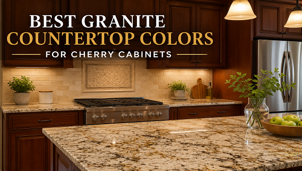
Cherry cabinets bring warmth, depth, and character into a kitchen. Their rich red and brown tones can make the room feel comfortable and welcoming. However, because cherry wood already has a strong color, choosing the right granite requires care. A countertop that looks too busy or too dark may make the room feel heavy. In contrast, the right stone can help the cabinets look balanced and polished.
Why Granite Color Matters with Cherry Cabinets
When I match granite with cherry cabinets, I first look at the cabinet tone. Some cherry cabinets appear light and golden, while others have deep red, brown, or burgundy shades. The finish also matters. A glossy finish reflects more light, while a matte finish can make the wood look deeper and softer.
For homeowners who like strong contrast, I often recommend reading more about cherry cabinets and black granite combinations. Black granite can look bold and elegant, especially when the kitchen has good natural light, pale walls, and a light backsplash. However, I usually avoid pairing very dark granite with dark cherry cabinets in a small room because the space may feel closed in.
Key Takeaways
-
Light granite creates contrast and helps cherry cabinets feel less heavy.
-
Warm granite supports the wood tone and gives the kitchen a calm, connected look.
-
Lighting changes every color, so I always check samples inside the kitchen.
Light Granite Colors That Brighten Cherry Cabinets
Light granite is one of my favorite choices for cherry cabinetry. It lifts the room and creates a clear break between the wood and the countertop. As a result, the kitchen often feels more open.
White Granite
White granite can give cherry cabinets a clean and fresh background. Still, pure white granite is uncommon. Most white slabs include gray, black, beige, gold, or brown markings. Those small details can connect the stone to the cabinet color.
For example, I often like white granite with soft gray veins when the kitchen has stainless steel appliances. On the other hand, white granite with gold or brown flecks works well with warm hardware and cream walls. Because cherry cabinets may darken over time, a light countertop can also help the room keep a balanced look.
However, I do not choose white granite based on a small sample alone. Granite patterns can change across the slab. Therefore, I prefer to view the full piece and place cabinet samples beside it.
Cream Granite
Cream granite gives a softer contrast than bright white. It works especially well in traditional kitchens, warm farmhouse spaces, and rooms with beige or tan floors. In addition, cream tones can make red cherry cabinets feel calmer.
I often choose cream granite when the backsplash includes ivory, warm white, or light brown. The result feels connected without making every surface the same color. However, I watch for strong yellow tones. Too much yellow can clash with the red undertone in cherry wood.
Light Gray Granite
Light gray granite offers a cooler contrast. Therefore, it can make cherry cabinets look more current without removing their natural warmth. Gray granite also pairs well with brushed nickel, chrome, or stainless steel.
Still, I pay attention to the gray undertone. A blue-gray slab may feel cold beside deep red cabinets. In contrast, a warm gray or greige slab often feels more natural. For this reason, I compare the countertop with the cabinet door under both daylight and evening light.
Warm Granite Colors for a Comfortable Kitchen
Some homeowners do not want strong contrast. Instead, they want the kitchen to feel warm and connected. In that case, I look at beige, gold, tan, and brown granite.
Beige Granite
Beige granite is a safe and flexible choice. It can include cream, brown, gold, gray, and black details. Because of that mix, it often links cherry cabinets with several other finishes in the room.
For example, beige granite can connect dark cherry cabinets with a light tile floor. It can also support oil-rubbed bronze hardware or warm wall colors. However, I avoid beige slabs that match the cabinets too closely. A small amount of contrast helps each surface stay clear.
Gold Granite
Gold granite can bring out the warm glow in cherry wood. It often includes cream, amber, brown, black, and rust-colored details. Therefore, it works well in kitchens with warm lighting and traditional design.
However, gold granite can become visually busy. If the slab has large movement, I keep the backsplash simple. A plain cream subway tile can calm the room and let the granite remain the main feature. In addition, simple flooring helps prevent the space from feeling crowded.
Brown Granite
Brown granite creates a deep and rich look. I usually use it when the cabinets are medium cherry rather than very dark cherry. This pairing can feel comfortable and grounded, especially in a large kitchen.
Still, brown granite needs enough contrast. A countertop that looks almost the same as the cabinets may cause the kitchen to lose shape. Therefore, I look for slabs with cream, gold, or light gray markings. Those lighter areas create separation and add visual interest.
Dark Granite Colors for Bold Contrast
Dark granite can look dramatic with cherry cabinets. However, it requires careful planning. I check the room size, window placement, wall color, flooring, and artificial lighting first.
Black Granite
Black granite gives cherry cabinets a formal and polished look. It works well with simple cabinet doors, stainless steel appliances, and light walls. In addition, black granite can make the red tones in cherry wood appear richer.
However, I use black carefully in smaller kitchens. Dark counters and dark cabinets can absorb light. Therefore, I often pair this combination with under-cabinet lighting, a pale backsplash, and a lighter floor. A polished black slab may also show fingerprints, water spots, and dust more clearly than a patterned surface.
Charcoal Granite
Charcoal granite is softer than solid black. It may include gray, silver, white, or brown specks. Because of this variation, it can connect cherry cabinets with modern appliances and cooler design details.
I like charcoal granite in kitchens that mix traditional wood cabinets with cleaner lines. However, I still keep nearby finishes light. A soft white backsplash, light gray walls, or pale wood flooring can keep the room from feeling too dark.
Deep Green Granite
Deep green granite can pair beautifully with cherry wood because green sits across from red on the color wheel. As a result, the two tones can create a strong but pleasing contrast.
Still, green granite is a bold choice. I often select a slab with subtle movement rather than bright emerald color. Forest green, black-green, or deep olive tones can feel refined. In addition, brass or bronze hardware can support the warm and natural look.
Granite Patterns That Work Well with Cherry Wood
Color matters, but pattern matters too. Cherry cabinets already have visible wood grain and strong color. Therefore, I think carefully about how much movement the countertop should have.
Soft and Even Patterns
Granite with small, even speckles creates a calm surface. It works well when the cabinets have detailed doors, raised panels, or decorative trim. Because the countertop stays quiet, the cabinetry remains the main feature.
I also like even patterns in small kitchens. Large swirls can make a compact countertop feel crowded. In contrast, a smaller pattern can make the surface look more consistent.
Flowing Veins and Movement
Granite with flowing movement can add drama to a simple kitchen. It works best with plain cabinet doors and a quiet backsplash. However, I always check how the pattern will run across seams, corners, and islands.
For a large island, bold movement can become a strong focal point. Still, I avoid adding a patterned backsplash beside it. Too many active surfaces can compete with one another.
Mixed Flecks and Minerals
Granite with brown, gold, black, and cream flecks can tie together several kitchen finishes. For example, one slab may connect cherry cabinets, stainless steel appliances, bronze handles, and beige flooring.
When I help homeowners compare slabs, I ask them to identify the smallest colors in the stone. Those minor tones often guide the backsplash, wall paint, and hardware choices.
How Kitchen Lighting Changes Granite Color
Lighting can completely change how granite looks. A slab that appears cream in a showroom may look yellow at home. Likewise, a gray stone may appear blue under cool LED lights.
Therefore, I never rely on showroom lighting alone. I take samples into the kitchen and view them during the morning, afternoon, and evening. I also place them flat on the cabinets because countertop color looks different when the sample lies horizontally.
Natural light usually makes granite colors easier to see. However, kitchens with little sunlight need stronger artificial lighting. Under-cabinet lights can brighten the work surface and reveal the stone pattern. Warm bulbs can support beige and gold granite, while neutral bulbs often suit white and gray stone.
In many Milwaukee homes, winter light can feel cooler and weaker. Therefore, I pay extra attention to indoor lighting when matching cherry cabinets with dark or cool granite. A warm, balanced lighting plan can keep the room welcoming through every season.
Matching Granite with Floors, Walls, and Backsplashes
A countertop should not match the cabinets alone. It must also work with the rest of the kitchen. Therefore, I review the floor, wall color, backsplash, appliances, and hardware as one group.
For floors, I avoid matching every brown shade exactly. Instead, I choose related tones with enough difference. For example, medium cherry cabinets can pair with a light oak floor and cream granite. Likewise, dark cherry cabinets can work with pale tile and light gray granite.
For walls, soft white, cream, warm gray, and light taupe often work well. However, the best wall color depends on the granite undertone. A countertop with gold details may suit cream walls, while a gray-and-white slab may suit warm gray paint.
For backsplashes, I usually keep the design simple when the granite has strong movement. A plain subway tile or quiet stone tile can give the eye a place to rest. On the other hand, a lightly patterned backsplash can work with granite that has a small, even pattern.
Homeowners who want to compare full slabs, edge samples, and finish options can visit countertop stores in Milwaukee and review the materials under different lighting conditions. Seeing the full slab helps me judge color movement, mineral placement, and possible seam locations more accurately.
Granite Colors I Use for Different Kitchen Styles
Different kitchen styles call for different granite choices. Therefore, I match the stone to the overall mood of the room.
Traditional Kitchens
For traditional kitchens, I often choose cream, beige, gold, or brown granite. These colors support the warmth of cherry cabinets and pair well with decorative doors, bronze hardware, and classic tile.
Modern Kitchens
For a more modern room, I prefer white, light gray, charcoal, or simple black granite. Clean edges and a quiet backsplash can make cherry cabinets feel less formal. In addition, stainless steel appliances add a cooler contrast.
Transitional Kitchens
Transitional kitchens mix classic and current details. Therefore, light granite with soft movement often works best. A white or greige slab can brighten cherry cabinets while still feeling warm.
Rustic Kitchens
For rustic spaces, I like granite with earth tones, natural movement, and a matte or leathered finish. Beige, brown, olive, and warm gray can support wood beams, stone floors, and handcrafted details.
Mistakes I Avoid When Pairing Granite with Cherry Cabinets
The first mistake I avoid is choosing a slab from a tiny sample. Granite varies across the full surface, so the final counter may look different from the sample.
The second mistake is ignoring the cabinet undertone. Cherry wood may lean red, orange, brown, or burgundy. Therefore, I place the slab beside an actual cabinet door instead of relying on memory.
The third mistake is making every surface dark. Dark cabinets, dark granite, dark floors, and dark walls can make the kitchen feel smaller. Instead, I add contrast through the countertop, backsplash, paint, or flooring.
The fourth mistake is mixing too many patterns. Detailed cherry doors, flowing granite, patterned tile, and busy floors may compete. Therefore, I choose one main feature and keep the other surfaces quieter.
Finally, I do not forget maintenance. Some dark polished stones show dust and water marks more easily. Meanwhile, lighter patterned granite may hide daily crumbs better. The right choice should fit the homeowner’s cleaning habits as well as the design.
How I Narrow Down the Final Granite Choice
I start by selecting three color groups rather than one exact slab. For example, I may compare cream, light gray, and black granite. This makes the first decision easier.
Next, I view full slabs and take clear photos. I also bring a cabinet door, floor sample, backsplash tile, and hardware piece. Together, these items show whether the kitchen finishes support each other.
Then, I check the slab under different light. I look for unwanted yellow, blue, pink, or green tones. I also study the movement and decide where the strongest pattern should appear.
For a Milwaukee kitchen with limited sunlight, I may choose a lighter slab with warm markings. However, for a bright Milwaukee kitchen with large windows, I may use charcoal or black granite without making the room feel heavy.
Final Thoughts
The best granite color for cherry cabinets depends on the cabinet shade, kitchen size, lighting, and the mood I want to create. Light granite gives strong contrast and helps the room feel open. Warm beige and gold granite create a comfortable, connected look. Meanwhile, black, charcoal, and deep green granite can add drama when the room has enough light.
I usually recommend white, cream, light gray, or soft beige granite for the widest design flexibility. However, darker granite can work beautifully when the backsplash, walls, and floors provide balance.
Most importantly, I compare the full slab with real kitchen samples. That step helps me see the true undertones and avoid costly color mistakes. With careful matching, granite can make cherry cabinets feel richer, brighter, and more balanced for many years.